Chaos as Aesthetic: How the Cluttered Internet of 2001 Became the Vibe of 2024
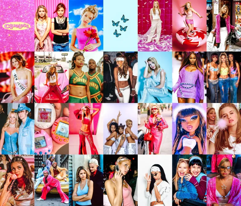
Photo: Y2K retro aesthetic maximalist colorful 2000s digital collage, via i.etsystatic.com
Open a random MySpace profile from 2003 and the experience is almost physically overwhelming. Tiled backgrounds. Autoplay music. Blinking text in seven fonts. Animated GIFs stacked on top of each other like a digital garage sale. By every principle of modern UX design, it's a disaster. By the standards of a growing corner of the internet in 2024, it's aspirational.
Something is happening with the aesthetics of the web — and it goes deeper than nostalgia.
Y2K maximalism, that chaotic visual grammar of the early 2000s internet, has been staging a quiet comeback for a couple of years now. But lately it's accelerated into something that feels less like a trend cycle and more like a genuine aesthetic stance. The cluttered, the garish, the proudly overstimulating — these qualities are being reclaimed by Gen Z and younger millennials in ways that are worth paying attention to, especially if you care about what visual culture is actually saying underneath the surface.
What We Mean When We Say Y2K Maximalism
Let's be specific, because this aesthetic has a lot of layers. At its most surface level, Y2K maximalism is about visual density. More is more. Competing elements don't resolve into a hierarchy — they coexist in productive tension. Think Bratz doll packaging. Early 2000s Hot Topic. The original Neopets interface. Lisa Frank on a caffeine binge.
But the aesthetic isn't just about objects or colors. It's about a particular relationship to information and attention. Pre-algorithm internet was genuinely overwhelming in a way that felt different from today's overwhelming. Every website you visited was somebody's personal creative project, assembled with whatever tools they had available, optimized for nothing except their own taste. There was no A/B testing. No conversion funnel. No design system ensuring visual consistency across platforms.
The result was cacophony. And increasingly, that cacophony looks like freedom.
The Minimalism Hangover
To understand why maximalism is resonating right now, you have to understand what it's reacting against. The last decade of digital design has been defined by minimalism — clean lines, white space, sans-serif fonts, muted color palettes. Think Apple's aesthetic influence radiating outward across every app, every website, every startup pitch deck. The visual language of Silicon Valley became the visual language of the internet.
And it made sense for a while. As mobile screens got smaller and attention spans got shorter, stripping away visual complexity felt like the responsible design choice. But minimalism also served another function: it made everything look the same. A dating app and a banking app and a food delivery app and a meditation platform all started sharing the same rounded corners, the same pastel gradients, the same friendly-but-neutral iconography.
Somewhere in there, digital design stopped feeling like expression and started feeling like compliance.
"There's a specific kind of exhaustion that comes from interacting with perfectly optimized interfaces all day," said one graphic designer we spoke to who runs a popular account documenting what she calls 'design maximalism' across social platforms. "Everything is smooth. Everything is frictionless. And after a while, frictionless starts to feel like... nothing. Like there's no one on the other side."
Nostalgia Isn't the Whole Story
It would be easy to dismiss Y2K maximalism as pure nostalgia — millennials getting misty-eyed about their AIM away messages, Gen Z cosplaying an era they didn't actually live through. And sure, some of it is that. Nostalgia is always part of aesthetic cycles.
But the emotional texture of what's happening right now feels more complicated. For younger people who grew up entirely inside the algorithmic internet — where every platform is continuously reshaped by engagement data, where your feed is a reflection of your tracked behavior rather than a genuine discovery space — the early internet represents something specific: a time when the web felt less like a product and more like a place.
The maximalism of that era encoded that feeling. When someone built a GeoCities page with seventeen different fonts and a background image of flames, they were making something. It was theirs. It was excessive and weird and completely divorced from any idea of what a "good" website looked like, and that was the whole point.
Reclaiming that aesthetic is, at least in part, a way of reclaiming that feeling of authorship. Of making something that couldn't have been generated by an algorithm because no algorithm would have made it.
Controlled Chaos in an Optimized World
There's a psychological dimension here that's genuinely interesting. We live in an era of extraordinary digital anxiety — constant connectivity, information overload, the ambient pressure of being perpetually available and perpetually performing. Minimalism was supposed to be the antidote to that. Calm your environment, calm your mind.
But for a lot of people, especially younger users who've grown up with wellness culture and its endless injunctions to simplify and declutter and optimize, minimalism has started to feel like another performance. Another thing you're supposed to do correctly. Another way to fail.
Maximalism, by contrast, makes a different offer: what if the chaos was the point? What if instead of trying to control and reduce your visual environment, you leaned into the mess? There's something genuinely liberating about an aesthetic that can't be wrong because it doesn't have rules.
This shows up in everything from bedroom decor trends (the return of the cluttered, layered, stuff-everywhere aesthetic that Pinterest spent years trying to replace with Scandinavian minimalism) to fashion (the resurgence of visible branding, logo stacking, clashing prints) to web design (independent creators and small brands deliberately building sites that look like they were made in 2002, complete with visitor counters and guestbooks).
What This Looks Like Going Forward
The honest answer is that Y2K maximalism probably won't take over the mainstream internet in any complete way. The forces that produced minimalism — mobile optimization, brand consistency, the economics of attention — haven't gone anywhere. Major platforms will continue to look like major platforms.
But what this aesthetic moment represents is something worth taking seriously: a genuine pushback against the idea that the internet should be smooth, optimized, and legible to algorithms. The people most invested in maximalism aren't just making a style choice. They're making an argument about what digital spaces should feel like — messy, personal, weird, alive.
At Veilthread, we find that argument pretty compelling. The most interesting stuff online has always existed in the spaces that don't quite fit — the corners that are too specific, too strange, too committed to their own logic to be easily categorized or monetized.
Maybe the comeback of Y2K chaos isn't about going backward at all. Maybe it's about insisting that the future of the internet should have room for things that are gloriously, unapologetically too much.
There's a frequency in the static. Tune your screen accordingly.